")
")

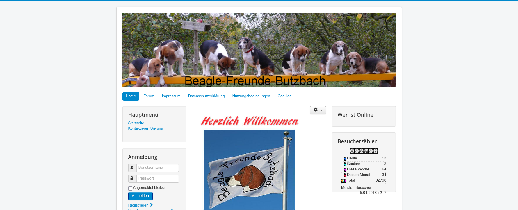
You don't have a logo and there is no text that fits instead of the logo on your website. Instead, you want to display a banner at the top of your Joomla website. Your menu should appear under this banner. The logo or the alternative text should not be visible at all. You would prefer your website to look exactly as you created it using Joomla 3 and Protostar. How can this be done with Cassiopeia?
This is how it should look:
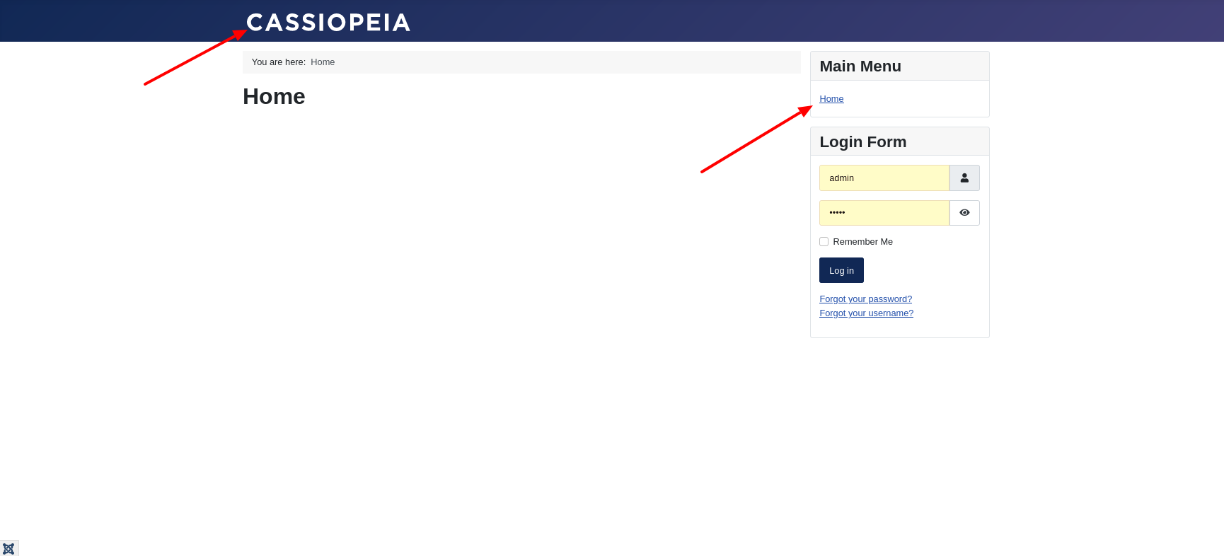
The front end of a fresh Joomla 4 installation looks similar with Cassiopeia as you can see in the next picture. At the top is the area that contains the brand or branding.
- Without user-defined changes, the title defined in the options of the template is displayed here. If there is no title yet, the name of the template is the fallback position. That is why Cassiopeia appears at the top of the image.
- The menu is located in the right sidebar.
The navigation horizontally and in the area at the top
First, we move the navigation upwards and display it horizontally.
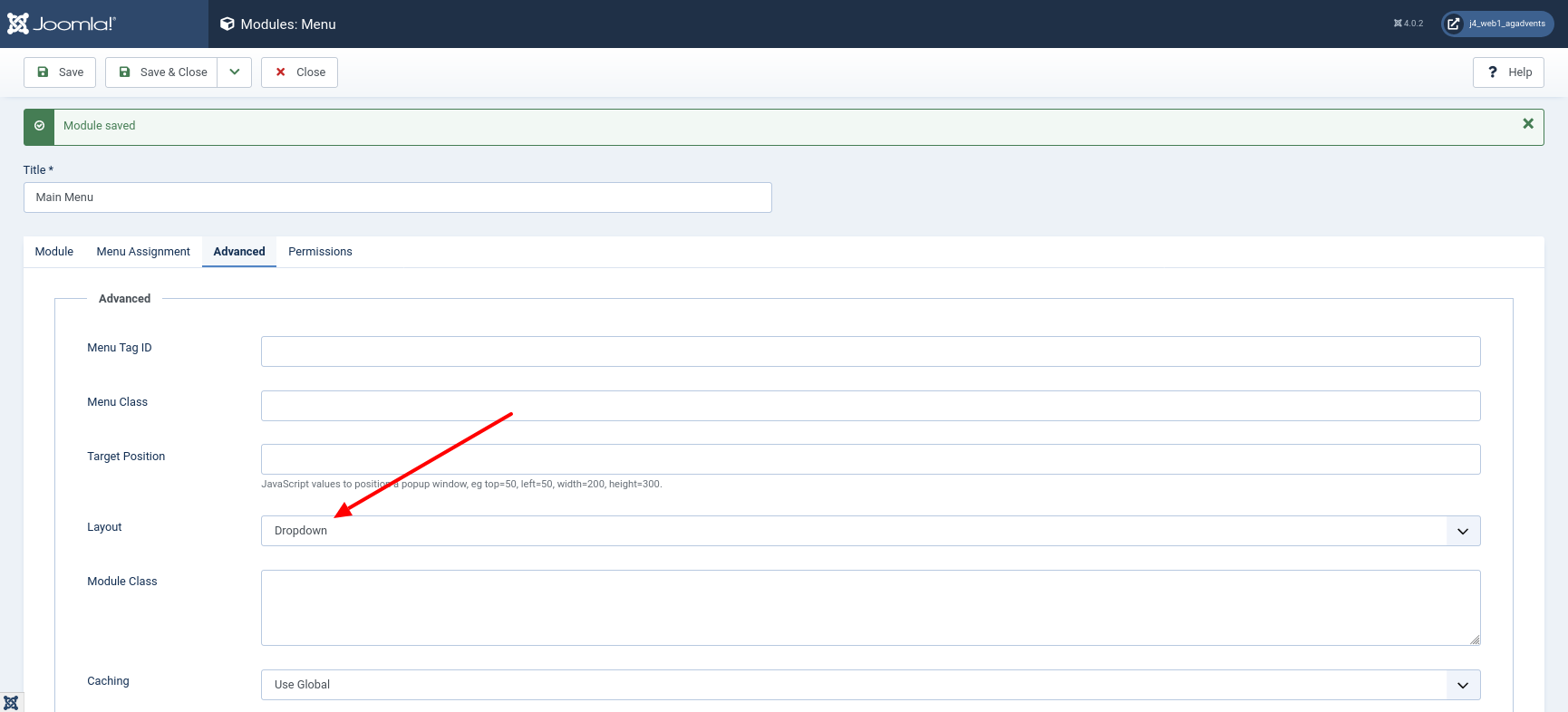
To do this, open the module in which the navigation is implemented via the left-hand page navigation 'Content | Site Modules' in the backend. In a fresh installation, this is the 'Main Menu'.
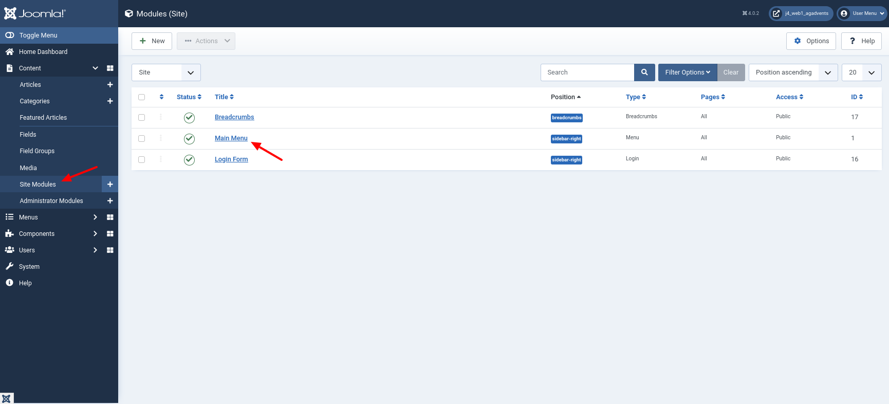
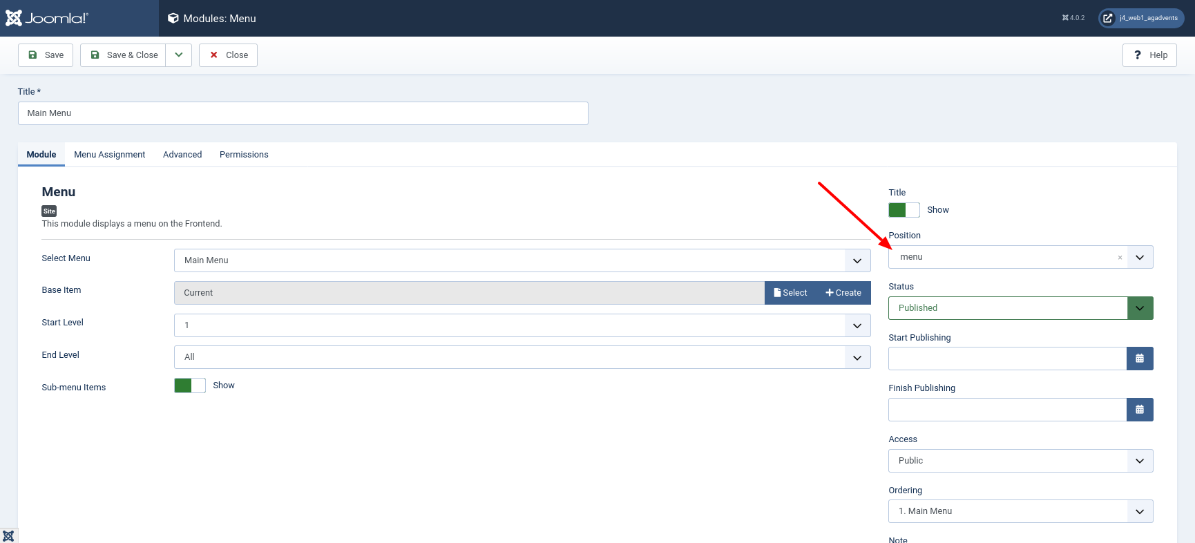
First, make sure that the position menu is selected.
Then select the correct layout from the tab 'Advanced'. If you want the navigation to change to a Hamburgermenu when the screen width is small, then select 'Collapsible Dropdown'. If you still want to display the menu items as text when the screen width is small, then select Dropdown.
Background information on the layouts 'Collapsible Dropdown' and 'Dropdown' can be found in PR 33978
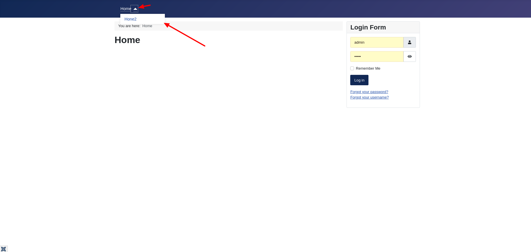
Now, look at the result in the front end. The menu is now at the top of the screen and you can open submenu items by clicking on a small triangle if they are available.
Make the logo invisible
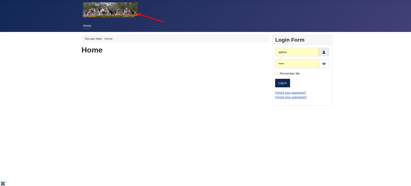
The text Cassiopeia in the upper area is still annoying. This can be replaced with an image or other text via the template options in the backend. However, the replacement is not displayed over the full width and is therefore not an alternative for a banner.
Why is the logo not an alternative for a banner image?
The logo, or the alternative text, is not displayed across the full width because this element is integrated into the Boostrap 5 element navbar-brand. See for yourself and have a look at the file index.php.
<?php if ($this->params->get('brand', 1)) : ?>
  <div class="grid-child">
    <div class="navbar-brand">
      <a class="brand-logo" href="<?php echo $this->baseurl; ?>/">
        <?php echo $logo; ?>
      </a>
      <?php if ($this->params->get('siteDescription')) : ?>
        <div class="site-description"><?php echo htmlspecialchars($this->params->get('siteDescription')); ?></div>
      <?php endif; ?>
    </div>
  </div>
<?php endif; ?>
The next image shows you what it would look like if you uploaded your banner image as a logo image.
Bootstrap 5 navbars come with built-in functionality for a lot of sub-components. The Joomla project makes use of some pre-built Bootstrap 5 elements in the frontend and backend templates. If you would like to have a look at the functions offered by the Bootstrap 5 Navbar, you will find a first starting point in the Bootstrap documentation getbootstrap.com/docs/5.0/components/navbar/.
Hide logo area in Cassiopeia
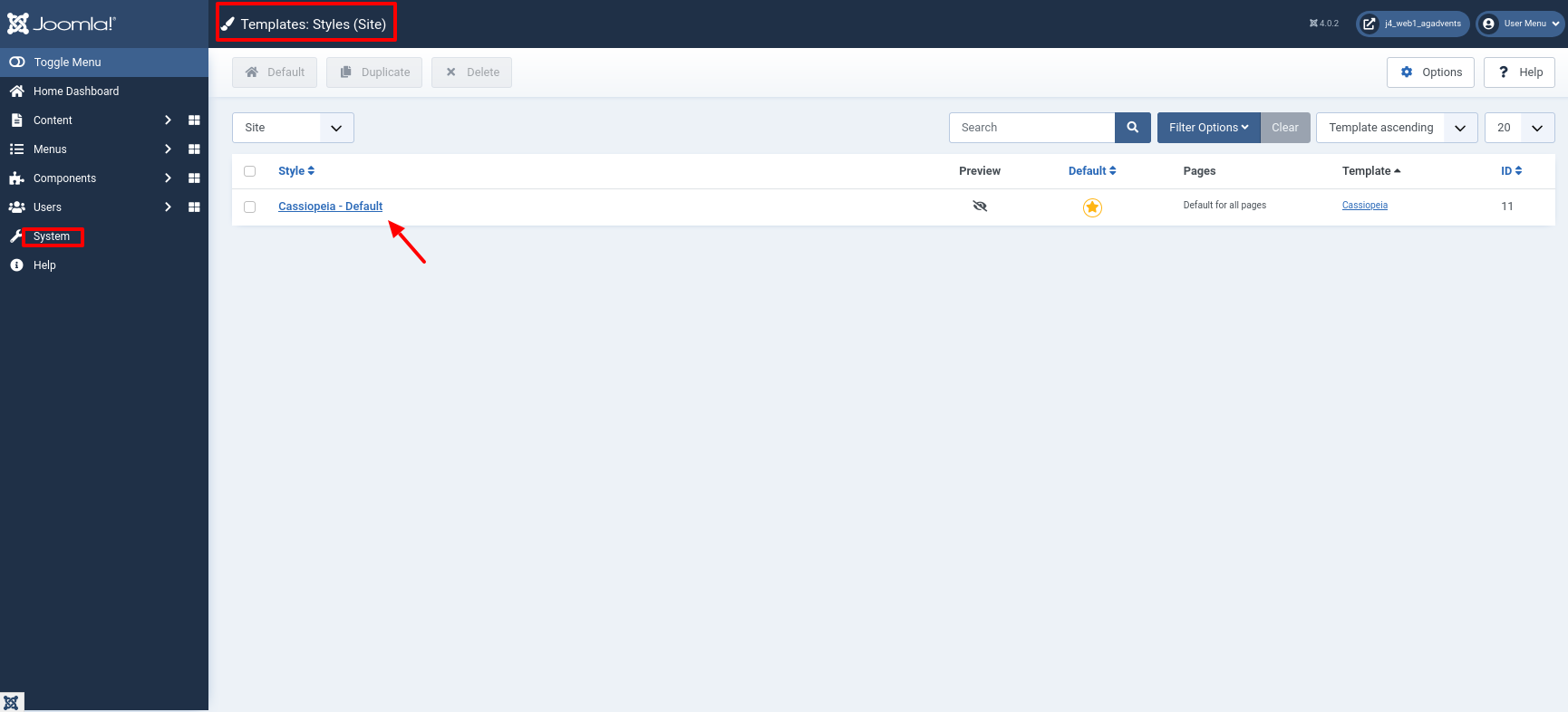
We do not need the bootstrap navbar and therefore disable the logo and title text. To do this, navigate to the 'Site Template Style'.
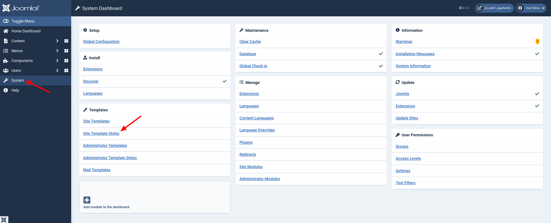
Select the style Cassiopeia - Default.
and set the option Brand to No.
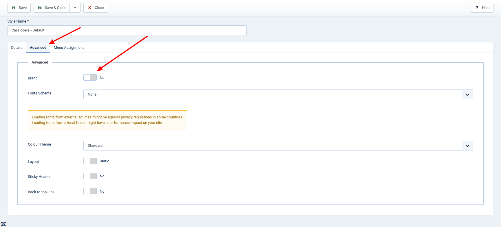
Make sure that the word 'Cassiopeia' is no longer displayed in the frontend.
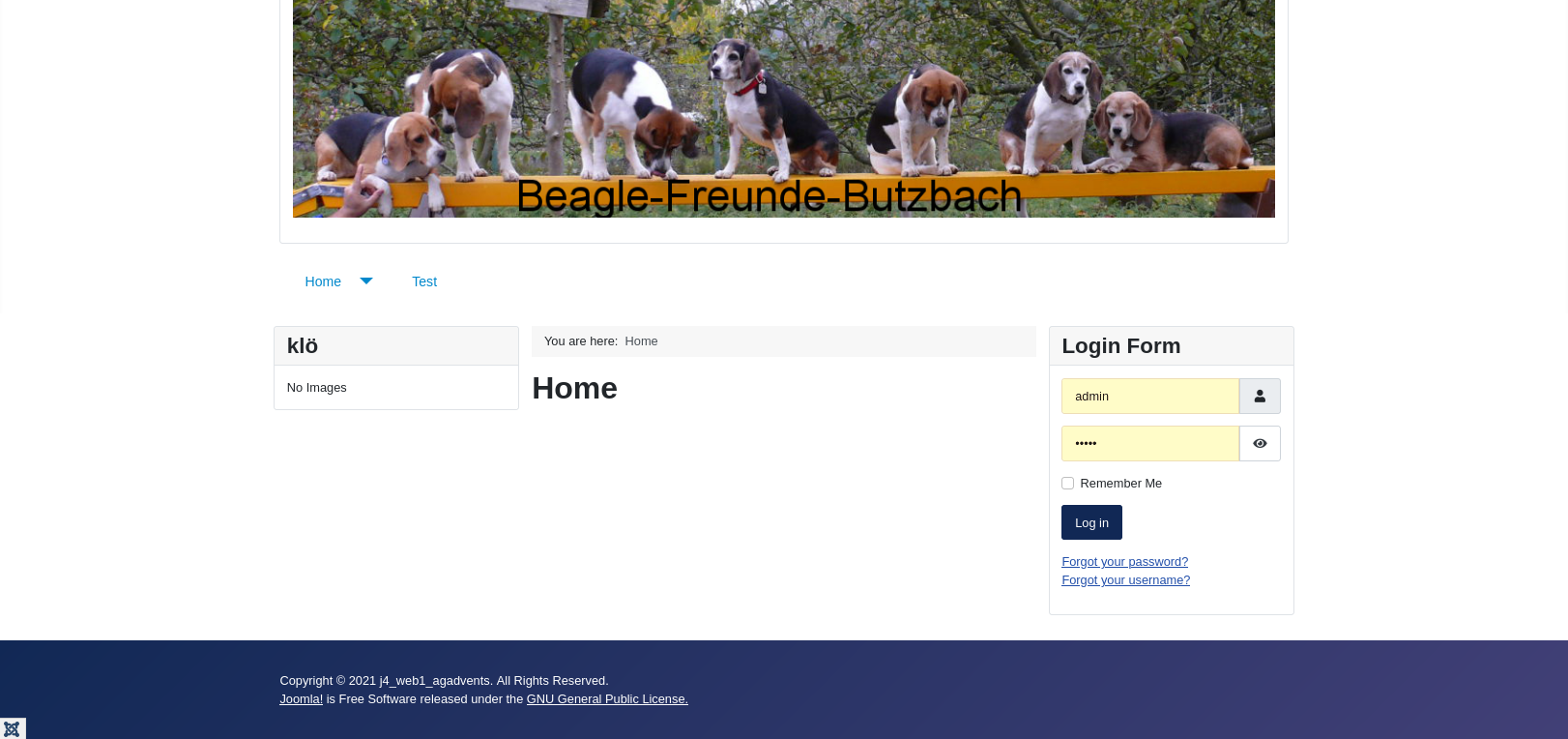
Show banner
Now the banner is still missing. If we want to show this, it is mandatory that we create it first. In Joomla, there are several possibilities. I choose a module of the type Custom.
Create banner
Via the menu 'Content | Site Module' I open the module manager.
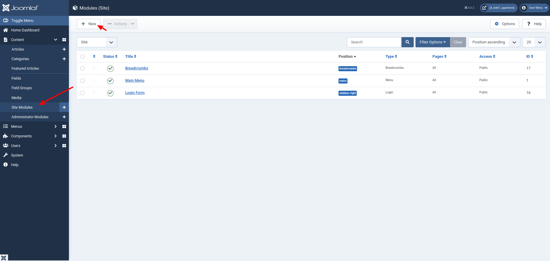
A click on the New button lists the module selection, in which Custom is in the middle area, and I also click to open the dialogue for creating a custom module.
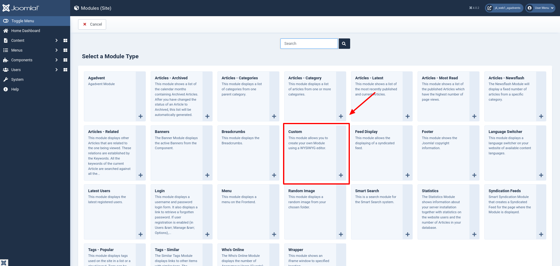
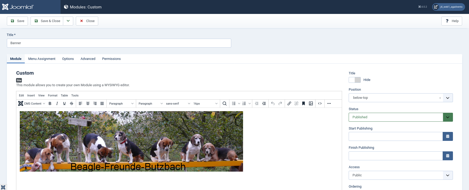
I name the module Banner so that I can easily assign it later. However, I want to display the banner image without a title. Therefore, I deactivate this display in the right-hand area. With the help of the Tiny MCE Editor, Joomla makes it easy for me to open the Media Manager and select an image for display. As a position, I choose 'below-top'.
A few words about the positions: The positions
below-topandtopbarare there to display content above the branding area and the navigation menu. In contrast to the position 'topbar', which uses the full screen size at all times, 'below-top' only fills the container. If you have chosen the layout option 'fluid' for your template, the difference is not great. With thestaticsetting, the difference is immediately noticeable on large screens. By the way,below-topandtopbarwere integrated into Joomla 4 only shortly before the end via PR 31731[^github.com/joomla/joomla-cms/pull/31731] and 33751[^github.com/joomla/joomla-cms/pull/33751]. Are you wondering why I decided against the position 'banner'? The intention was that the banner should be displayed above the navigation. The position 'banner' displays the banner below the navigation and the branding area.
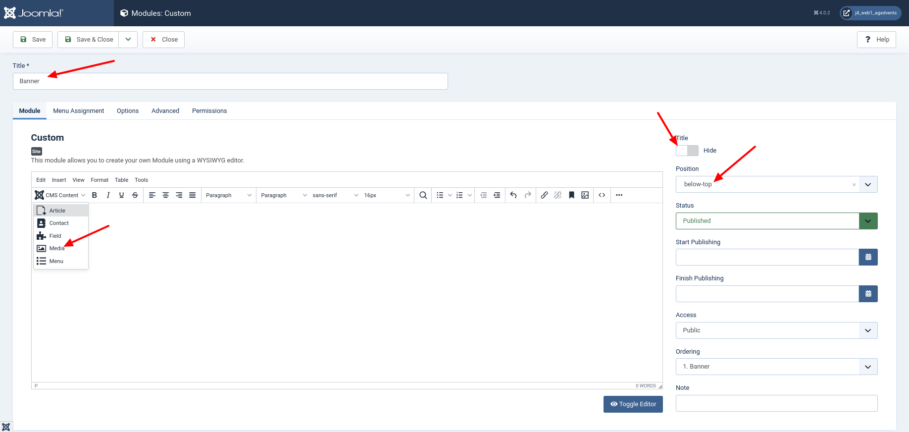
In the Advanced tab, we prepare the styling. As module class, I add mybanner and I set as module Chrome card so that the class is rendered.
If you wonder why the module class is only used after setting a module chrome, read the discussion in issue 30822[https://github.com/joomla/joomla-cms/issues/30822].
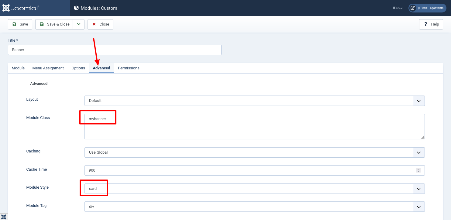
Insert banner image
In the Media Manager, I have the possibility to upload an image, edit it and select it at the end via the button 'Insert Media'.
As a result, I see the image in the editor.
Style banner
It is important to me that the image fills the width of the container at any display size. Therefore, I add CSS styles that make this possible. To do this, I switch to the code view of the editor via the 'Toggle Editor' button.
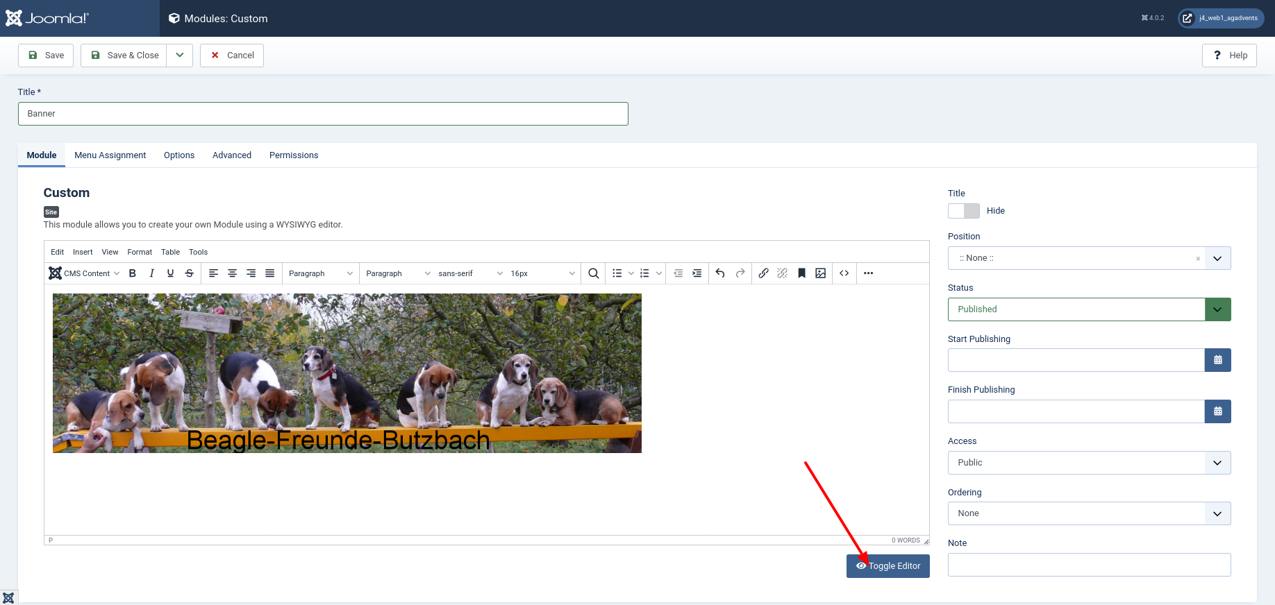
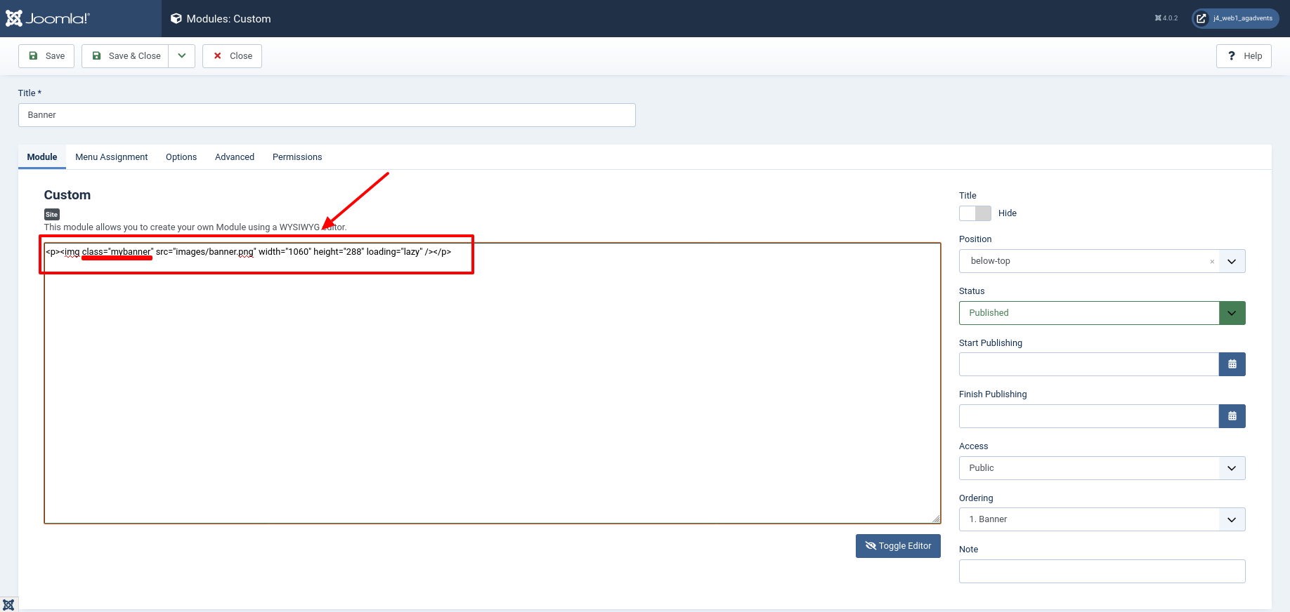
In the code view, I add the class mybanner to the HTML--element and click the button
Save and Close in the toolbar to save. The complete code looks like this:
<p><img class="mybanner" src="images/astrid/banner.png" width="1060" height="288" loading="lazy" /></p>
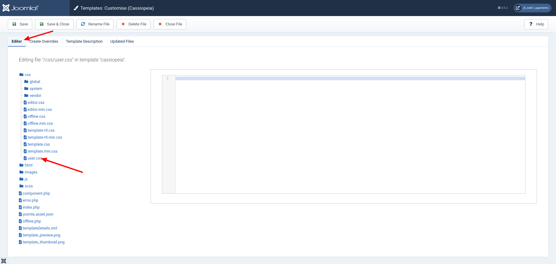
The following image shows how and where I add the code via Joomla backend.
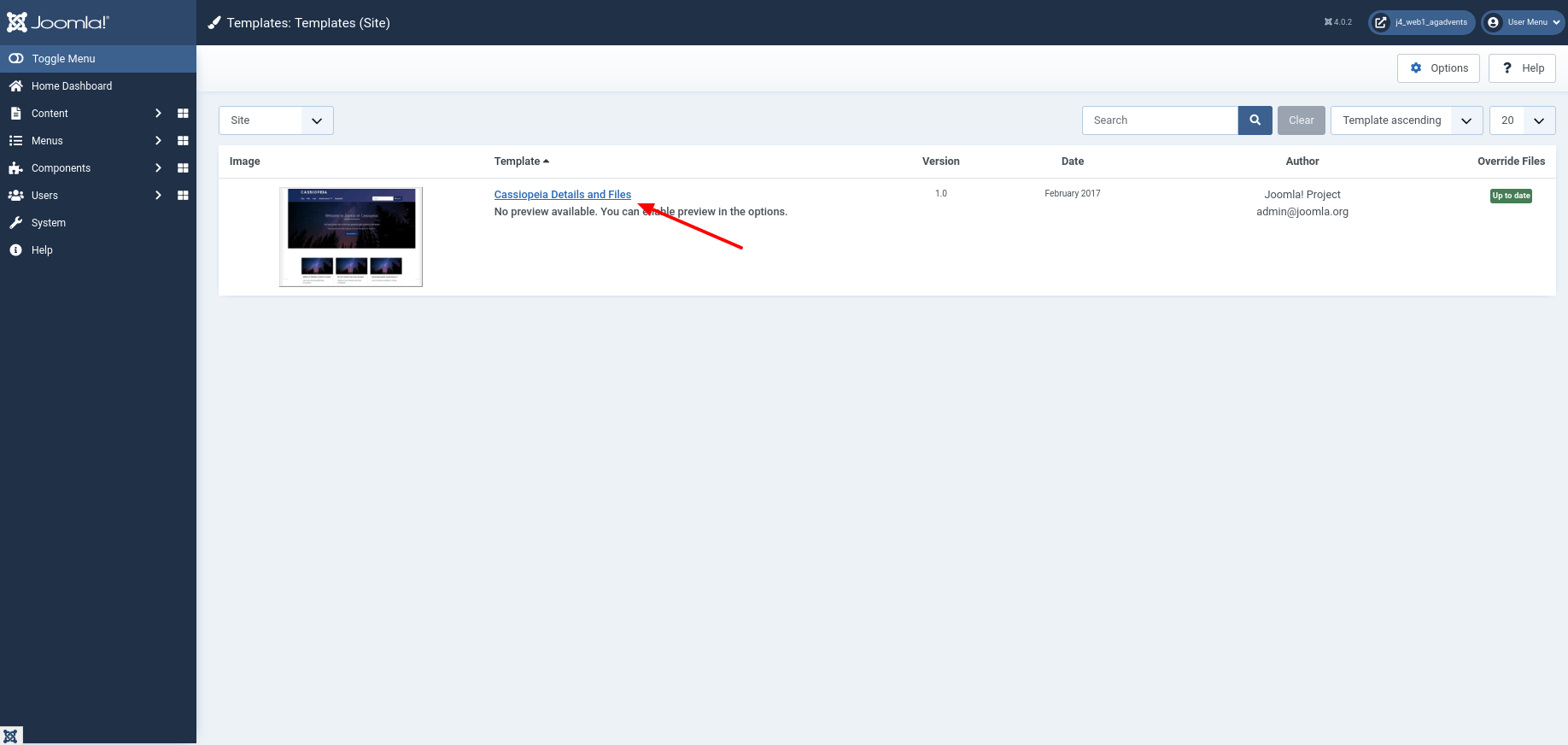
Finally, I switch to the Template Manager to fill the CSS class 'mybanner' with CSS styles. To do this, I open the view 'System | Site Templates' via the left navigation.
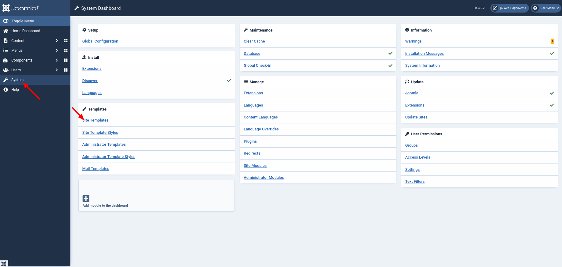
I select the Cassiopeia template by clicking on 'Cassiopeia Details and Files'.
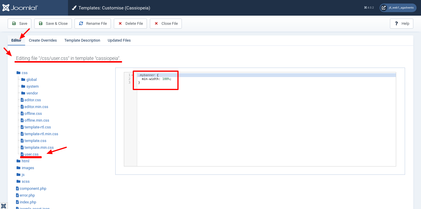
Within the Tab Editor I first check if there is already a file named user.css in the directory css. As a reminder, user.css is the file provided for implementing custom CSS styles in Joomla. This file is not modified during an update.
I add the following code snippet to the end of the user.css file. I use this to set the minimum width of the banner image. I choose 100% so that the image always uses the full width of the element in which it is inserted.
Why do I use the unit
%and notvw, which can be found elsewhere in the Cassiopeia CSS file? The viewport dimensionsvw (viewport width)andvh (viewport height)can be used to define dimensions in relation to the very first enclosing block. For views on displays, this block is identical to the dispay dimensions. Compared to100 %,100 vwscales the image to the full screen width. Since I use the static layout, the image does not always start at the very right. The full screen width would therefore be wrong at this point. Information on the units possible in CSS has been summarised by the W3C[^w3.org/Style/Examples/007/units.en.html].
The framework Bootstrap, which is used in Cassiopeia, takes care of the maximum width of the banner image. By default, an image never takes more than 100% of the screen width. Specifically, I insert the code snippet shown below.
.mybanner {
  min-width: 100%;
}
The following image shows how and where I add the code via Joomla Backend.
Change colours
If you like the purple in the Cassiopeia template, then the current display may already be right for you. In most cases, there is another colour which should be the primary colour of the website. Therefore, we recolour the elements.
First we colour the background of the 'container-header' white. Because the purple is technically an image, the line background-image: none; is important! White font on a white background is not readable, so we change the font colour in .mod-menu via color: #0088cc;.
.container-header {
    background-color: white;
    background-image: none;
}

.container-header .mod-menu {
    colour: #0088cc;
}
When hovering with the mouse, the background of a menu item should appear grey. We can do this with background-color: #eee; for the menu item link .container-header .mod-menu a. To make the background look more loose, we add an inner padding padding: 3px 15px; and round off the corners via border-radius: 0 0 6px 6px;. The text should also be coloured blue in the link color: #0088cc;.
.container-header .mod-menu a {
  -webkit-border-radius: 0 0 6px 6px;
  -moz-border-radius: 0 0 6px 6px;
  border-radius: 0 0 6px 6px;
  padding: 3px 15px;
  colour: #0088cc;
}

.container-header .mod-menu a:hover {
    background-color: #eee;
}
Last but not least, we take care of the hamburger menu. This is white in Cassiopeia. Since the background of the header area of our website is now white, we colour it blue to correspond to the font. The hamburger menu is located in the element .container-header .navbar-toggler. We colour the three bold strokes with color: #0088cc; and the line border: 1px solid #0088cc; is used for the border.
.container-header .navbar-toggler {
    color: #0088cc;
    border: 1px solid #0088cc;
}
In the following, I will summarise the code in the file user.css.
/* Banner Image */
.mybanner {
  min-width: 100%;
}

/* Menu */

/* Override the lila background with white */
.container-header {
    background-color: white;
    background-image: none;
}

/* Text should now be blue */
.container-header .mod-menu {
    color: #0088cc;
}

/* We add padding and radius so that on hover there is a nice background */
.container-header .mod-menu a {
    -webkit-border-radius: 0 0 6px 6px;
    -moz-border-radius: 0 0 6px 6px;
    border-radius: 0 0 6px 6px;
    padding: 3px 15px;
    color: #0088cc;
}

/* On hover there should be a gray background*/
.container-header .mod-menu a:hover {
    background-color: #eee;
}

/* We need to change the color of the Hamburger Menu because white on white is not good */
.container-header .navbar-toggler {
    color: #0088cc;
    border: 1px solid #0088cc;
}
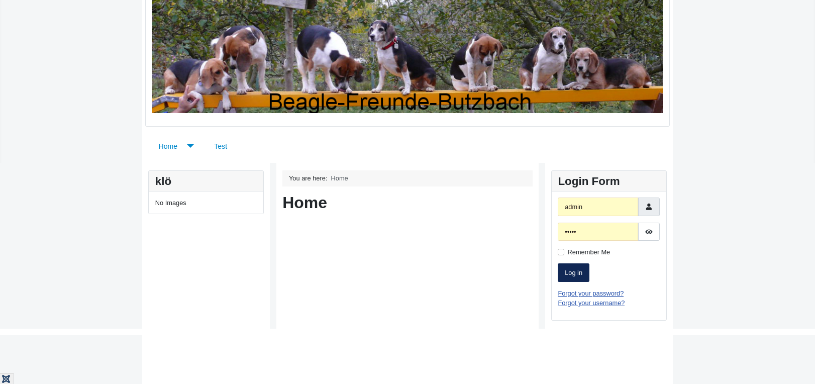
As a result, we now see a website with neutral colours.
Giving the website a frame
With the standard template Protostar in Joomla 3, it was possible to display content with a fixed width in a container in such a way that everything was surrounded by a border. In Cassiopeia, this border does not appear without further action. We can create a similar effect with a workaround.To do this, we colour all background elements grey background-color: #f4f6f7; and give the elements containing content a white background background-color: white; and an inner space padding: 3px 15px;.
...
.site-grid {
    background-color: #f4f6f7;
}

.header {
    background-color: #f4f6f7;
}

.grid-child {
    padding: 3px 15px;
    background-color: white;
}

.footer {
    background-color: #f4f6f7;
    background-image: none;
}
